Upper Level, Bedroom & Bathroom Makeovers
We’re back with more images from our Cape Cod project. Today we are sharing the upper level, which has transformed into a truly amazing oasis for this family!

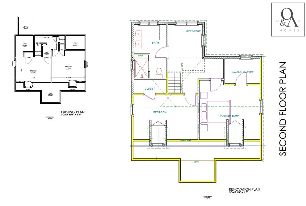
The original upper floor plan had 2 bedrooms on the upper level with tiny closets and a small landing area. We came in and added some height and square footage to the bedrooms, created a larger landing space, and added a much needed (freaking gorgeous) bathroom.
PLANS
LANDING
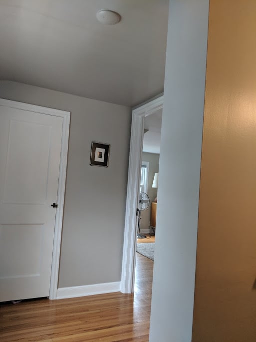
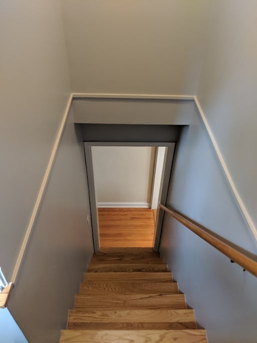
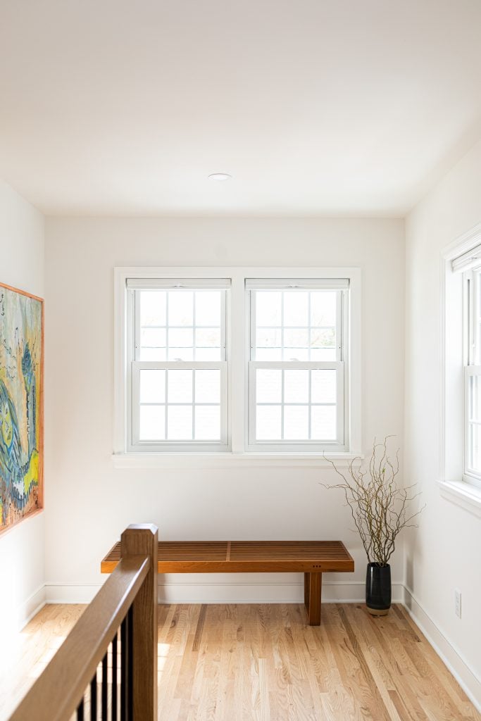
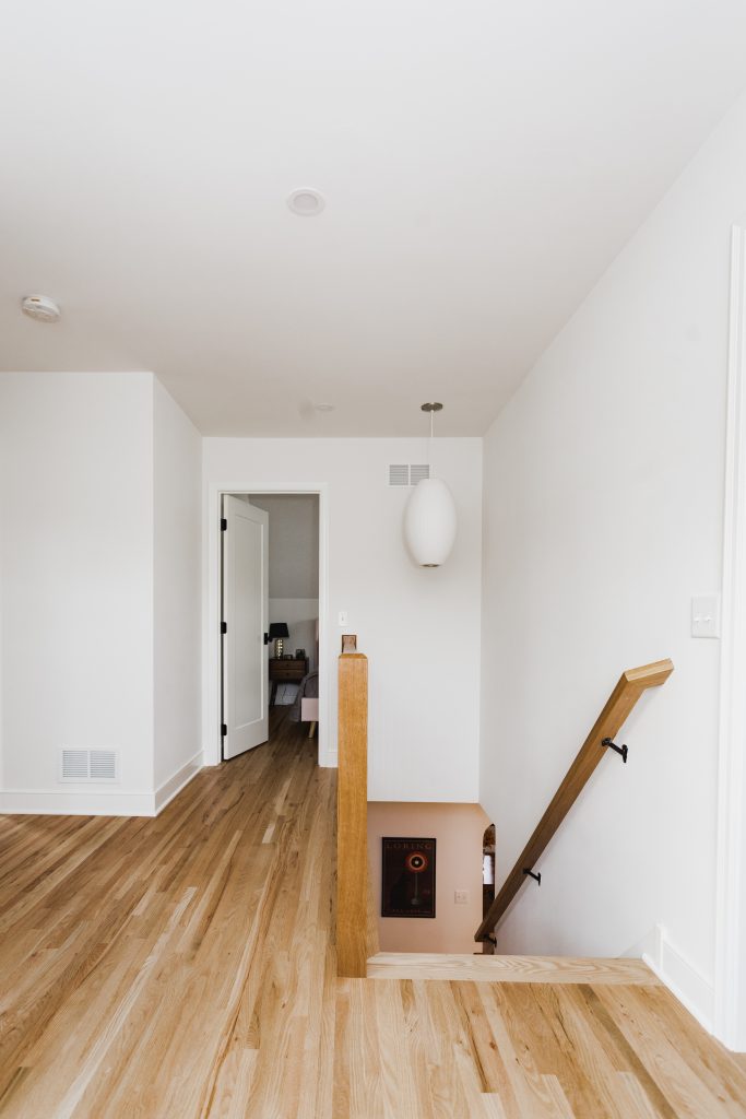
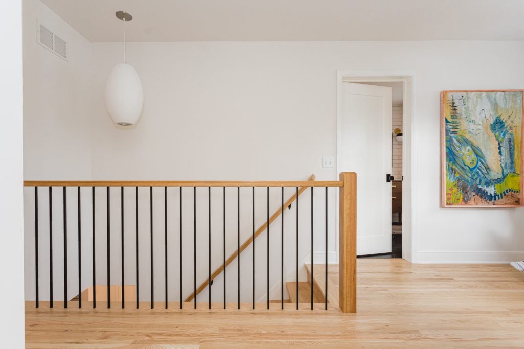
The original stairway was winding and tight. There was a plumbing soffit than ran right through the landing space and the ceilings were low, which made the space feel so much smaller than it was.
BEFORE
AFTER
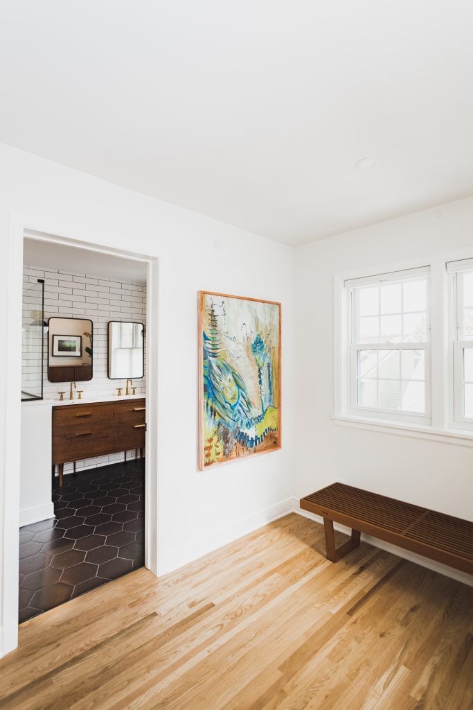
We removed the railing wall, expanded the space, and added another window to lighten everything up and create a more open and airy landing spot. The mix of natural oak and white woodwork gives the space a nice warmth and also allows for the stair railing feature pop.
 .
. 
And a little sneak peek into the new bathroom off the landing…
BEDROOM 1
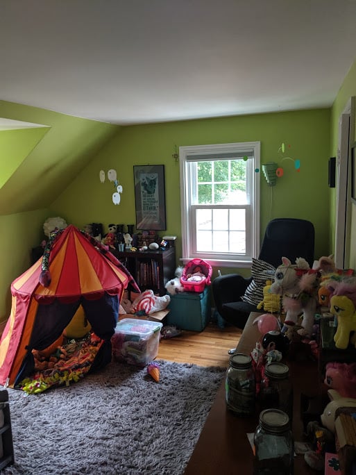
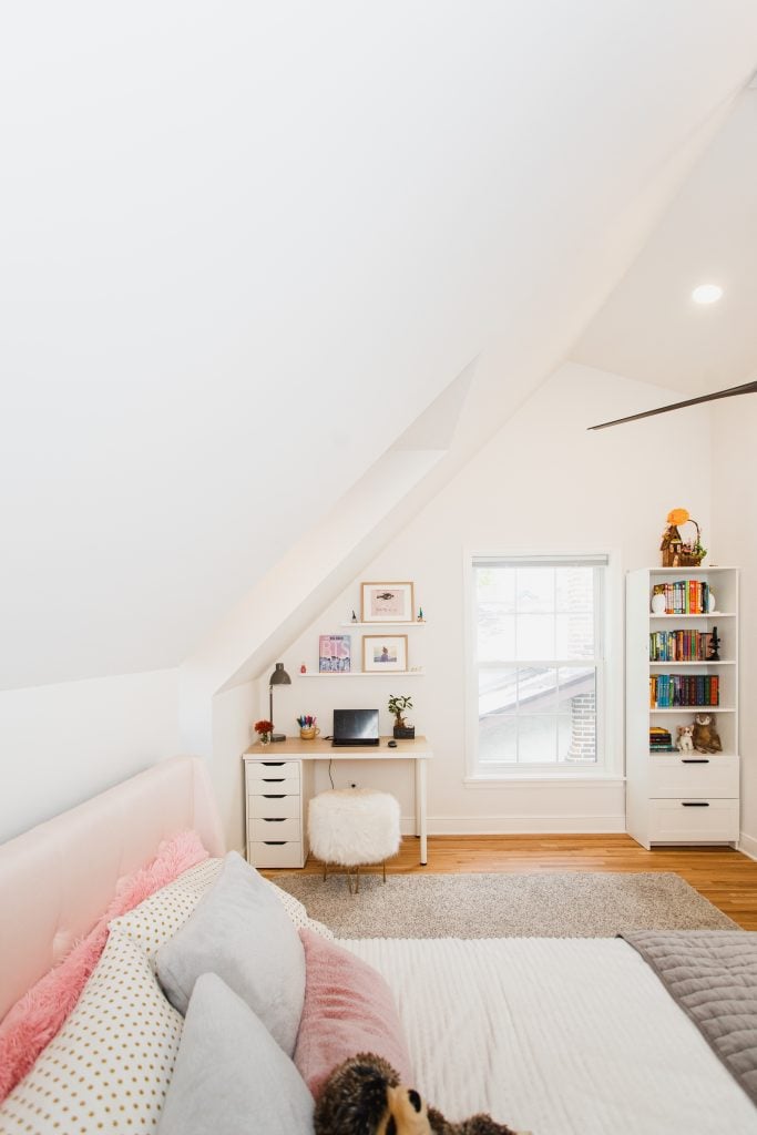
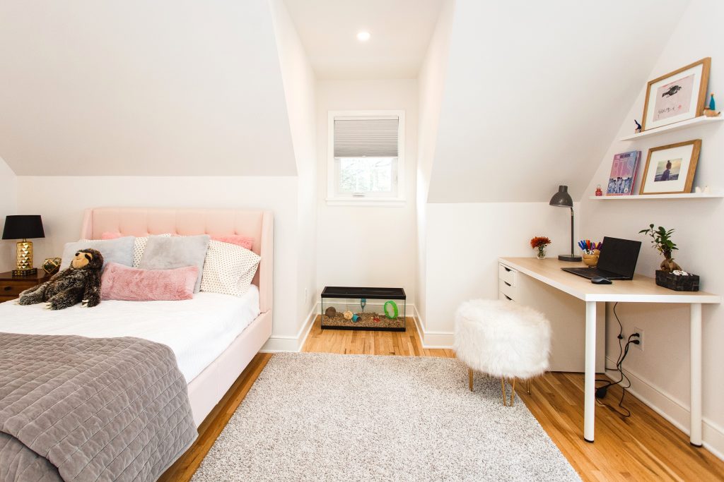
The original bedrooms were feeling cramped for the family, so we opened them up in both height and size. The closets in both bedrooms were small and awkward so better, smarter storage was a must!
BEFORE
AFTER
This sweet girl now has my childhood (and adult, let’s be honest) dream bedroom! She has a little desk area and a dormer window in the front vaulted ceiling, which serves as a reading nook and special spot for her hamster.
BEDROOM 2
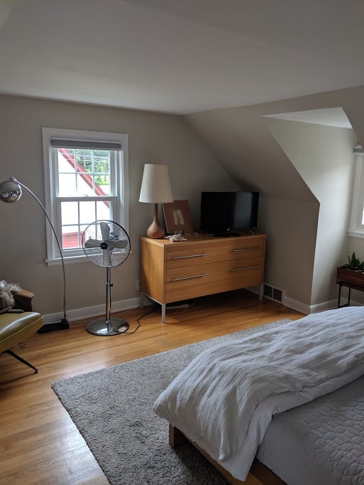
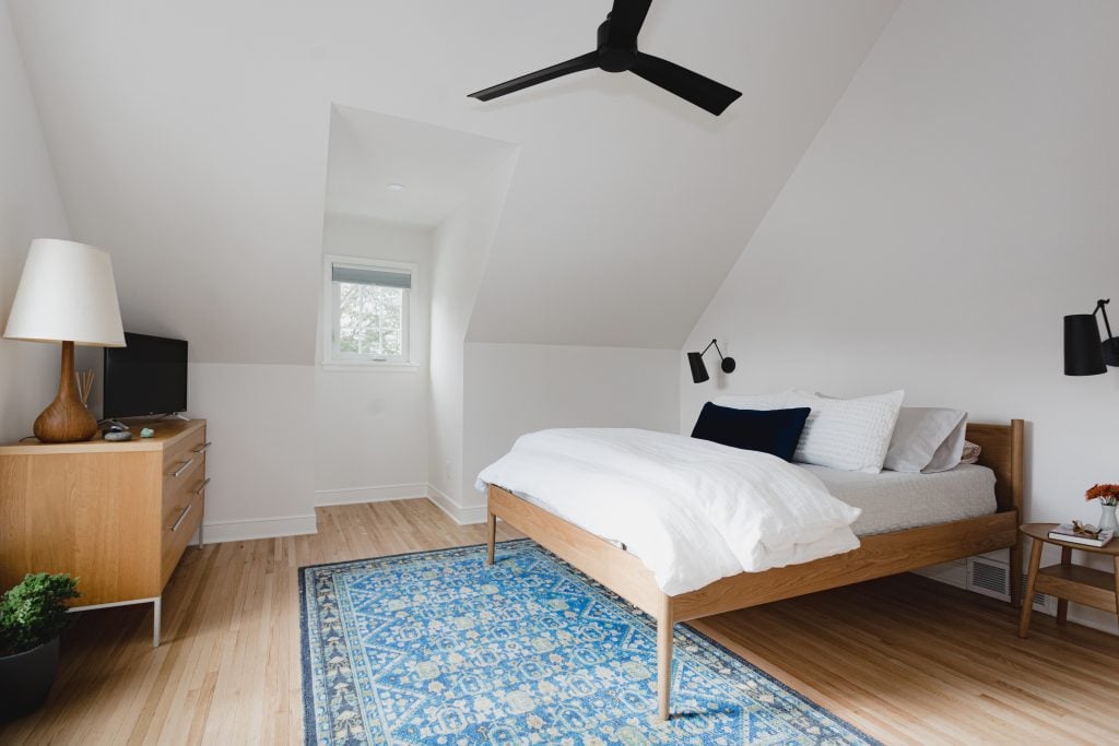
The original master bedroom was cramped and the heating and cooling wasn’t sufficient.
BEFORE
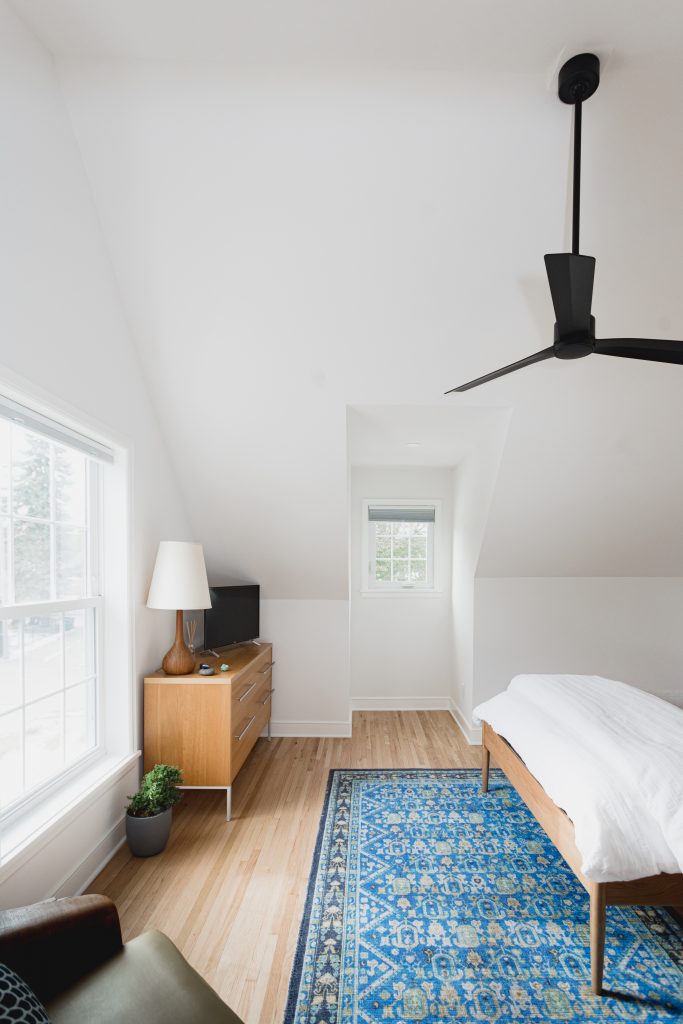
AFTER
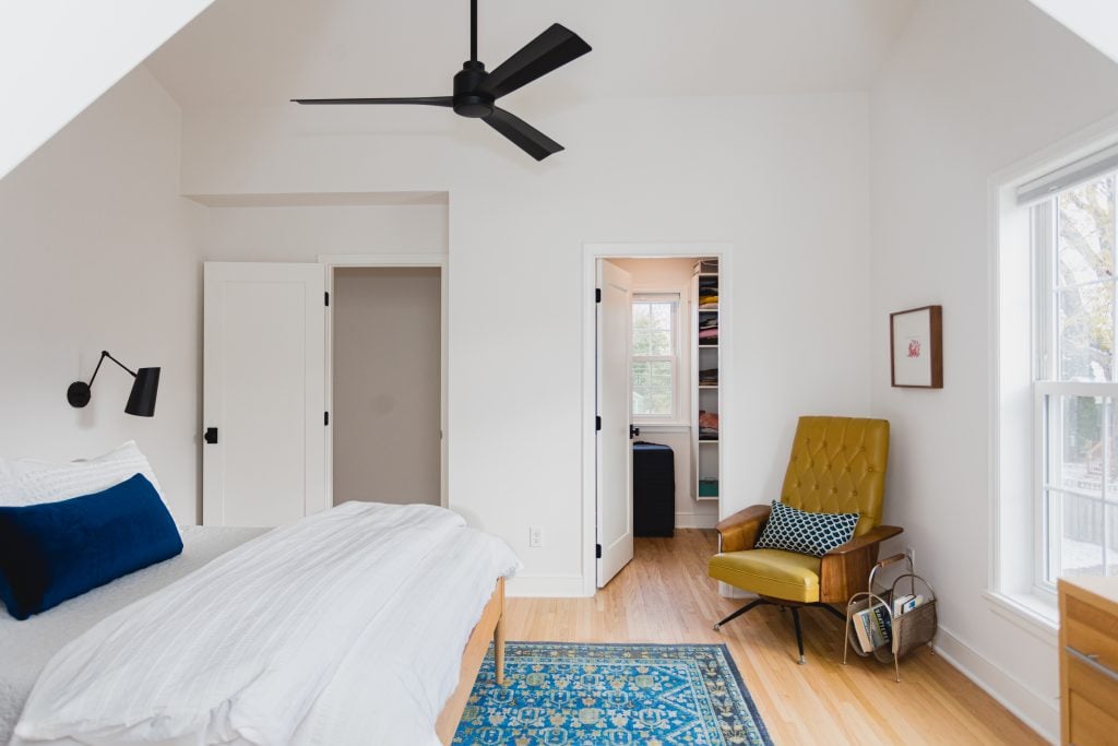
We adjusted the mechanicals to make the room more comfortable and added windows to all three sides of the house, creating wonderful ventilation and an elegant flow.
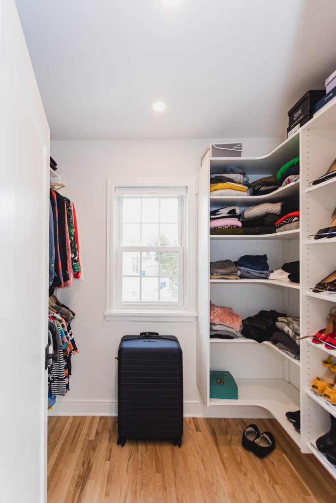
They now have a true walk-in closet!
BATHROOM
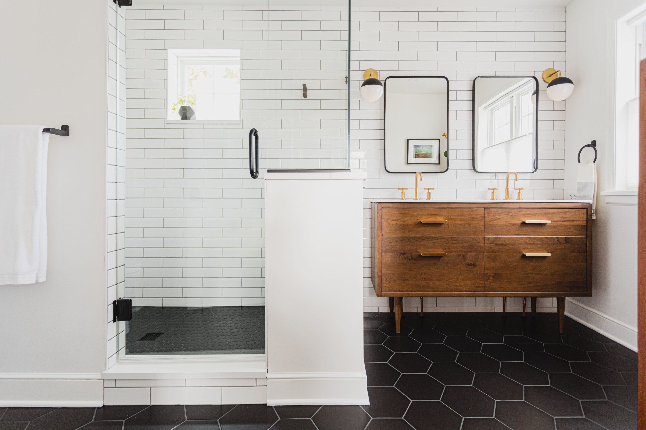
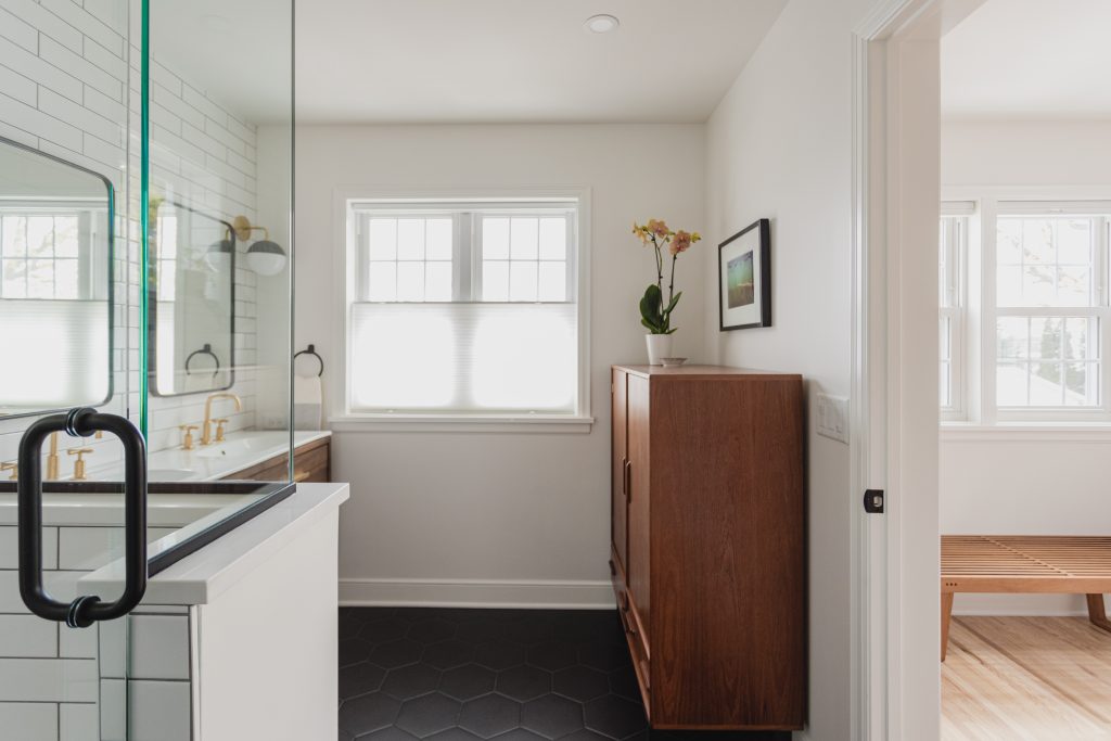
This brand new bathroom is arguably my favorite part of this whole renovation!
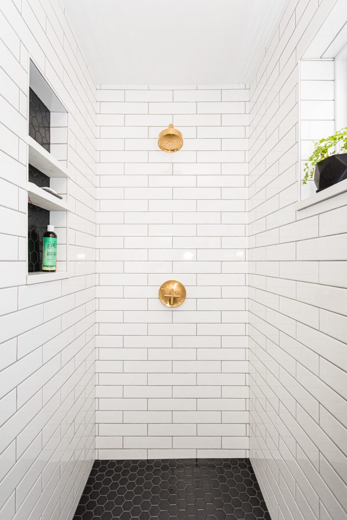
We used the Rejuvenation vanity as the inspiration for this space and incorporated a fun mix of matte black and brushed gold finishes to tie everything together. We extended the tile wall from the shower through the length of the vanity to create a larger and more cohesive feel.
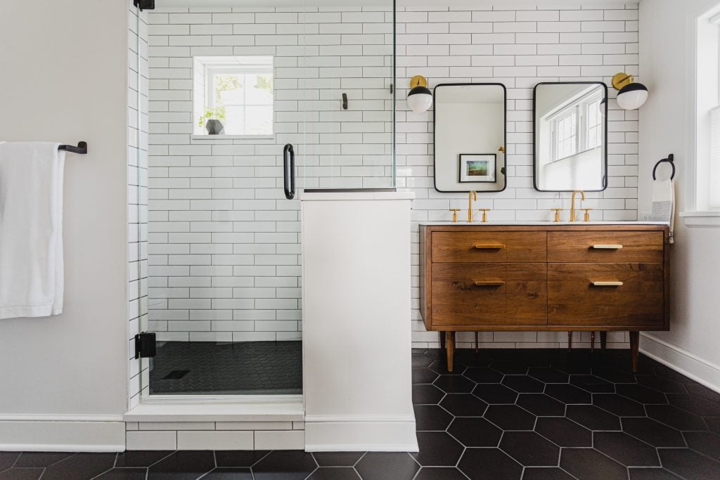
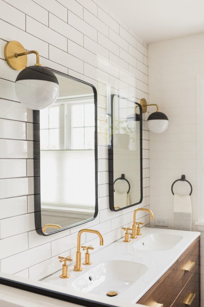
We built a beautiful 3-shelf cubby with coordinating tile in the shower to store soaps and shampoo and added in a little bench on the other side of the half wall. We also put in a high window to allow for more light while still maintaining privacy.
AND THAT’S IT!
There she is! What do you think??
A big huge thank you to this sweet family, for inviting us into and trusting us with their home. They were a true pleasure to work with. We hope they love their new space as much as we do!
Comments +